How to Turn a Visual Reference into a Usable Color Palette
A practical workflow for extracting colors from an image, assigning them clear roles, and checking that your palette works in real layouts.
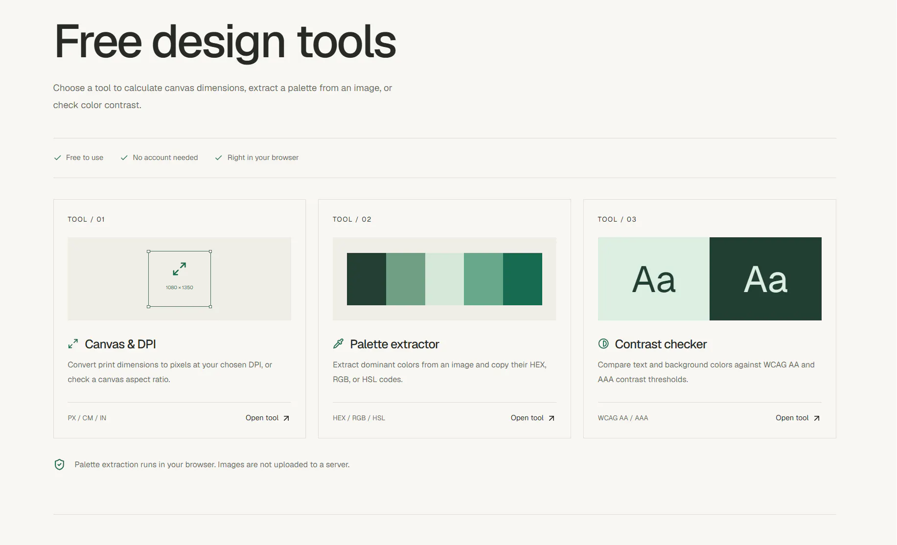
A photograph, illustration, or moodboard can be a useful starting point for a color system. But copying every sampled color rarely produces a palette that works across a real interface or design. The useful part is the thinking that comes after extraction: deciding what each color is for, and testing those choices in context.
1. Choose one clear reference
Start with a single image that captures the mood you want. A collection of unrelated references often mixes several lighting conditions and color directions, making the result feel scattered. Pick an image with a few colors you genuinely want to carry into the work, then keep it nearby while you make decisions.
2. Extract candidates, not final decisions
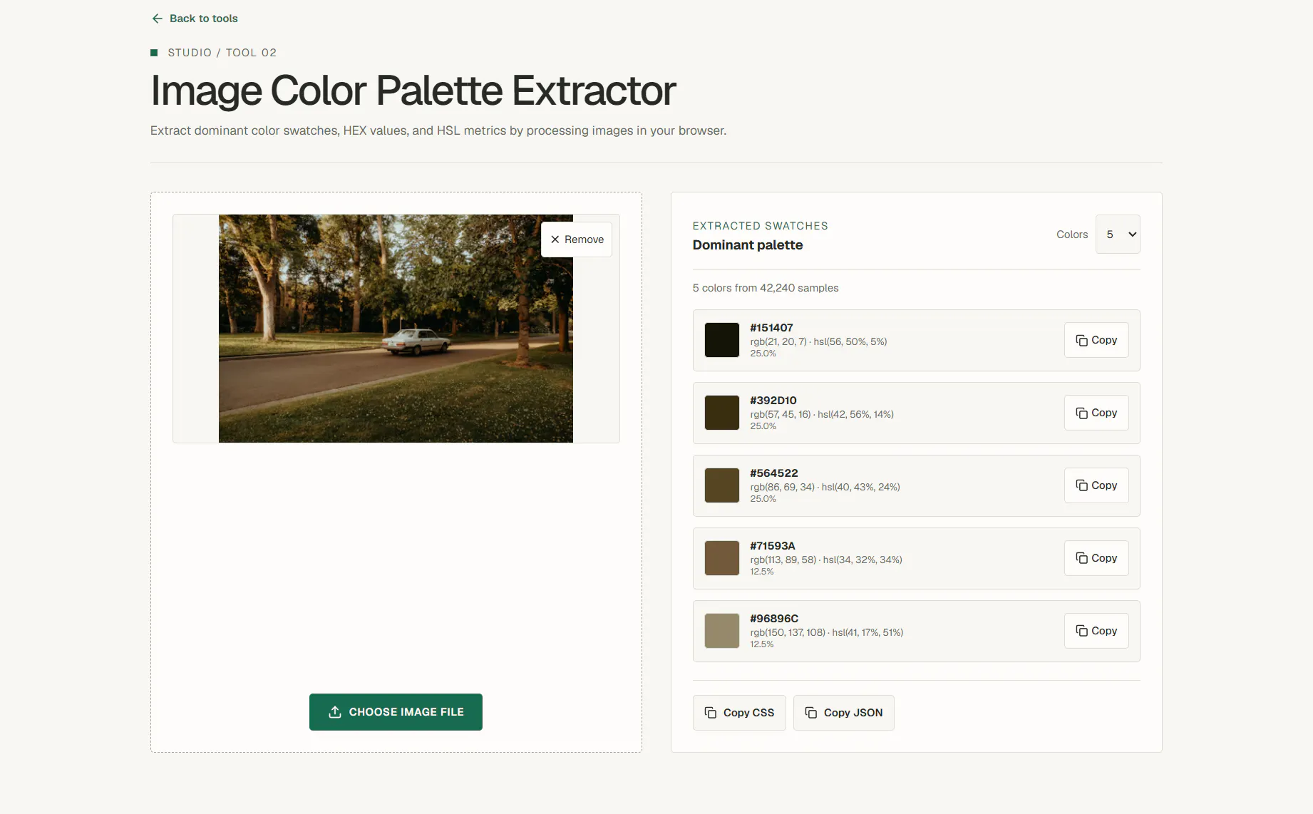
Use the Freeclay Palette Extractor to inspect prominent colors in the reference. Treat the output as a shortlist. A color that occupies a large area in a photo may be too strong for a page background, while a small detail may be the better accent. Keep only the colors that support the intended hierarchy.
3. Give each color a role
Write down what each selected color should do before adding more. A small starting set might include a page background, a main text color, a surface color, a primary action color, and one accent. Some colors can serve more than one role, but every role should remain distinguishable when the layout is viewed as a whole.
:root {
  --color-background: #f4f1e9;
  --color-text: #252923;
  --color-surface: #ffffff;
  --color-primary: #425c4a;
  --color-accent: #3f6f91;
}
These values are only an example. Replace them with colors from your own reference and check that the text and controls remain easy to read.
4. Check contrast where it matters
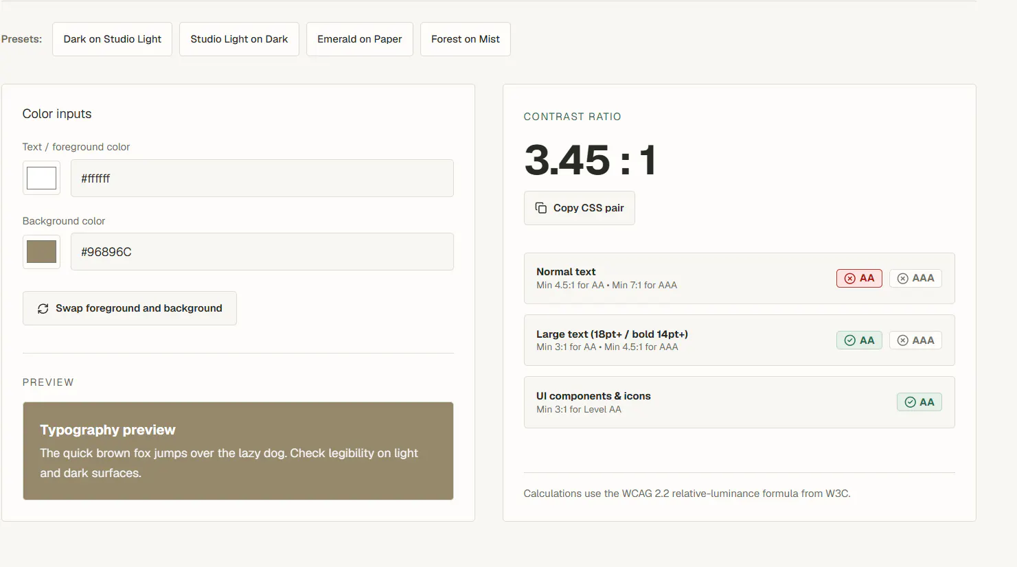
A palette can look balanced in swatches and still fail when used for small text, buttons, or labels. Test the actual foreground and background pairs you plan to use with the Freeclay Contrast Checker. If a pair is difficult to read, adjust its lightness or choose a different role for that color instead of adding a decorative outline everywhere.
5. Test it in a real layout
Apply the palette to a small but realistic screen: a heading, body copy, a card, a primary button, and a secondary action. Check it at the size people will actually see it, not only in a color picker. Look for competing accents, weak text, and surfaces that blend together. Then revise the roles before expanding the palette.
Keep the reference, but design for the work
A reference image helps establish a direction; it does not have to dictate every interface color. Extract a few candidates, assign deliberate roles, and test them against real content. The result will feel related to the source while still working as a practical system.